How to create Responsive Classic Report in ORACLE APEX?
We have been struggling to have the responsive Oracle APEX Classic Reports for decades now. Standard Oracle APEX which shows the tabular format of the dataset doesn't support the responsiveness as the device size changes.
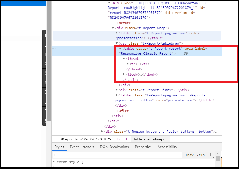
Let's take look the DOM rendering of classic reports.
It's a tabular structure follows by class "t-Report-report".
Steps to Make the report Responsive.
1. Create a Report Template.
- Go to Shared Components
- Templates
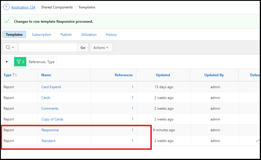
- Select Report Templates
- Make a copy of the standard report template
- Name as Responsive
2. Template Editing
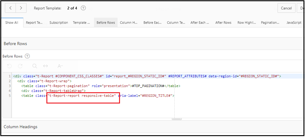
- Before Rows:
- Before Rows: Add responsive class to the table tag.
Or you can Remove everything and paste below code
<div class="t-Report #COMPONENT_CSS_CLASSES#" id="report_#REGION_STATIC_ID#" #REPORT_ATTRIBUTES# data-region-id="#REGION_STATIC_ID#">
<div class="t-Report-wrap">
<table class="t-Report-pagination" role="presentation">#TOP_PAGINATION#</table>
<div class="t-Report-tableWrap">
<table class="t-Report-report responsive-table" aria-label="#REGION_TITLE#">
- Column Templates:
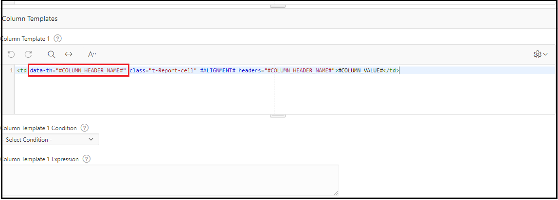
- Column Template 1: Add header data tag data-th="#COLUMN_HEADER_NAME#"
Or you can remove everything and paste below code
<td data-th="#COLUMN_HEADER_NAME#" class="t-Report-cell" #ALIGNMENT# headers="#COLUMN_HEADER_NAME#">#COLUMN_VALUE#</td>
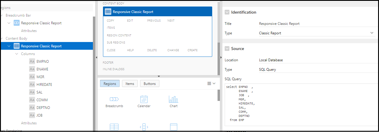
3. Create a Classic Report
- Sample Query
SELECT EMPNO ,
ENAME ,
JOB ,
MGR,
HIREDATE,
SAL,
COMM,
DEPTNO
from EMP
- Go to Report attributes and select Template
- Report Attributes
- Appearances
- Template: Responsive
4. Styling the Report
Add below CSS code to the page inline CSS.
.responsive-table {
margin: 0 0;
min-width: 300px;
}
.responsive-table th {
display: none;
}
.responsive-table td {
display: block;
}
.responsive-table td:first-child {
padding-top: .5em;
}
.responsive-table td:last-child {
padding-bottom: .5em;
}
.responsive-table td:before {
content: attr(data-th) ": ";
font-weight: bold;
width: 6.5em;
display: inline-block;
}
@media (min-width: 480px) {
.responsive-table td:before {
display: none;
}
}
.responsive-table th, .responsive-table td {
text-align: left;
}
@media (min-width: 480px) {
.responsive-table th, .responsive-table td {
display: table-cell;
padding: .25em .5em;
}
.responsive-table th:first-child, .responsive-table td:first-child {
padding-left: 0;
}
.responsive-table th:last-child, .responsive-table td:last-child {
padding-right: 0;
}
}
.responsive-table {
/*background: #34495E;
color: #fff;*/
border-radius: .4em;
overflow: hidden;
}
.responsive-table tr {
border-color: #46637f;
}
@media (min-width: 480px) {
.responsive-table th, .responsive-table td {
padding: 1em !important;
}
}
.responsive-table th, .responsive-table td:before {
color: #d55;
}
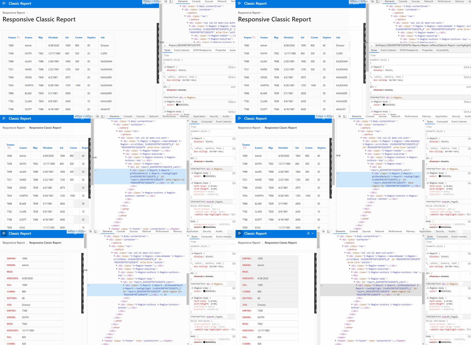
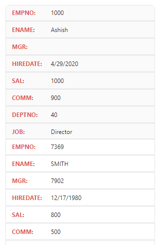
Now Run the report and make reduce your device-width.
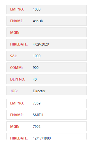
We can also make the little margin between td and th to split rows and cells.
.responsive-table th, .responsive-table td {
margin: .5em 1em;
}
You Might Also Like:




No comments:
Post a Comment
Please do not add any spam links or abusive comments.